
At first I had to decided what to do as my focus
for my project; I knew I wanted to do look at some kind of natural forms.
Something I would be instantly drawn towards is flowers and although that would
provide me with a wide spectrum of things to look at, I felt it is something
that has been done so many times, that it could be difficult to come up with
original ideas. But something I have been interested in for a very long time is
natural phenomenon’s, at first it was just a passing idea I had that I wasn’t
taking too seriously, as I thought it would be difficult to research. However
as I had a lack of other ideas I started looking at images of natural phenomenon’s,
they were so beautiful that I decided that I would after all like to focus on
Natural Phenomenon’s.

I started using www.pinterest.com to collect research
that I have found on the Internet. Pinterest is a great tool that allowed me
find helpful images that had any relevance to my project, the image link takes
you straight back to the original site where you found the image, it also
allows you to write any notes under the image that you may need.
This gave me the opportunity to find
lots of different natural phenomenon’s, which I could then choose from and
research further. For example, I originally wanted to look at the northern
lights and light pillars separately, but after researching I found out that the
light pillars are the version of the Aurora phenomenons. My research ranged
from looked at phenomenon’s that are caused by microscopic plankton, to nebula's
and supernovas. 


I was also able to find
designers and collections that relate to phenomenons. For instance, I looked at
different types of cloud formations, such as nacreous clouds (clouds that
differ in colouration, to look like mother of pearl when the sun is several
degrees below the horizon) as well as mammatus clouds (these are sometimes
referred to as breast clouds because of the pockets of water that form). A
designer/collection I found that related to this research is the collection
“last breathe” by Robert Wun. Although this collection was inspiration by the
biblical history of the death of Jesus, the amazing design definitely represent
air and clouds, Wun says his piece “visualises how his last breathe condensed
and paused in his body as if constructing the complicated blood veins with
air.” Although this piece was not inspired by directly by cloud formations,
there is definitely a link between the two.
While
I was still researching we were also doing workshops to create work, the
most successful of which was mono printing. The process was to cover a surface
in ink, place a piece of paper over the top and then draw on to the back of the
paper to create a line drawing in the ink. Instead of “drew” directly into the
ink, drew being a loose term; I used a piece of hessian to scratch flowing
patterns into the ink. Because of the small holes in the fabric, it created
some very fine lines, although it was just an experiment, for me it represents
the northern lights nicely, which is one of my favourite natural phenomenons. I
was very fortunate to find a designer who created a collection inspired by the
Northern Lights. .
The collection consisted mostly of evening gowns, most of which were
embellished with a variety of coloured Swarovski crystals. What I like most
about this collection is that he hasn’t used the obvious colours associated
with the Auroras Borealis, the greens and yellows that occur most commonly.
Instead the gowns are mostly black with dashes of colours showing the rarity of
the phenomenon’s, as well as using colours that occur only in the rarest
incidences. Also because the colours are
created with crystals when the light catches them they will shimmer, also creating
the illusion of the northern lights.
One of things I was worried about
when choosing natural phenomenons as my focus is that it would be difficult to
collect. In terms of research I visited the Liverpool World Museum, looking at
the astrology section as well as going to one of the 30 minutes presentations
have in the planetarium, which was very interesting, but didn’t really provide
anything useful, I also visited the Walker Art Gallery as well, to look at the
collection of “viral landscapes” by Helen Chadwick. In terms of other primary
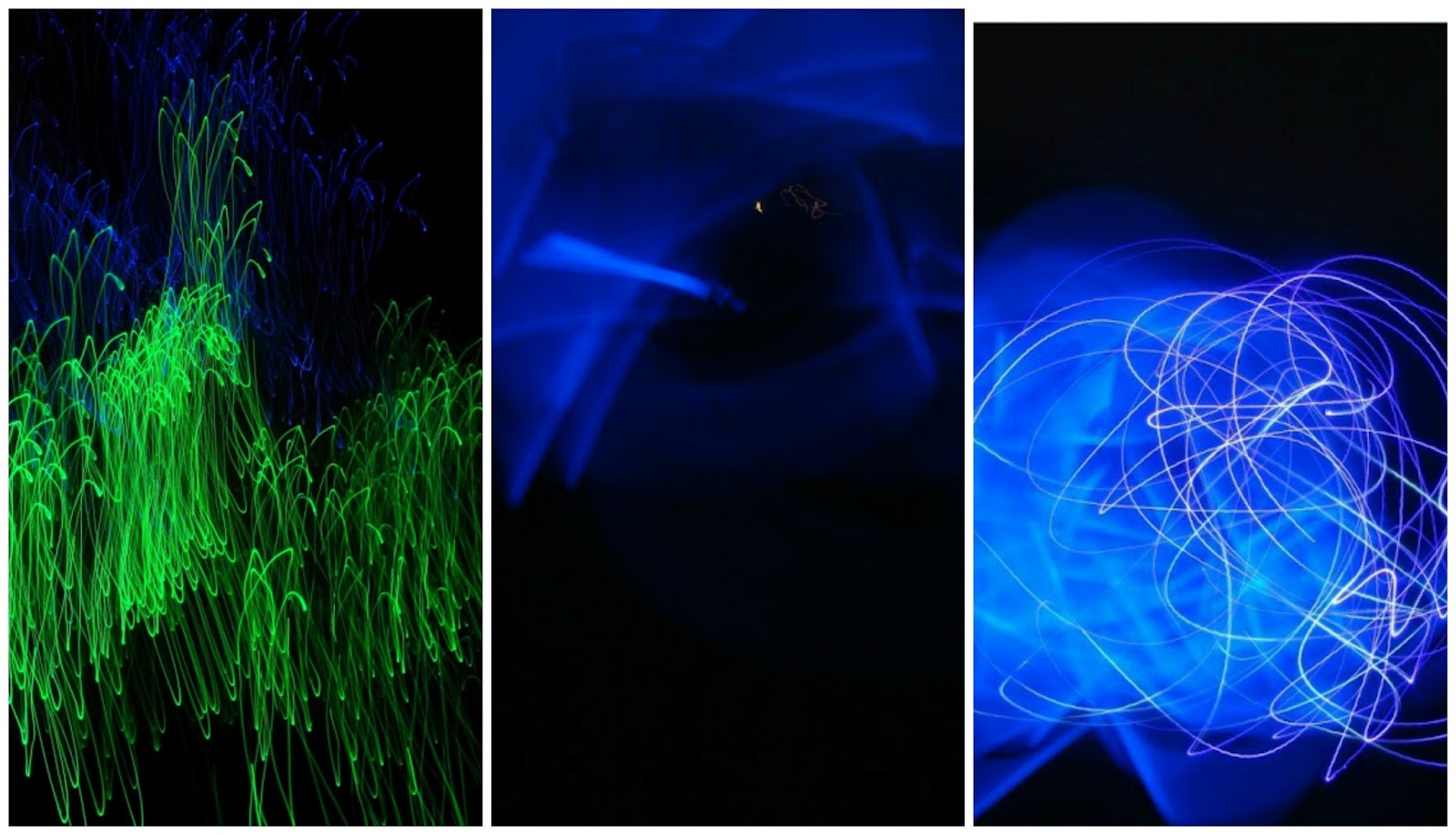
research I created my own light trail photographs. These also developed, as the
equipment I used got more sophisticated, and my method changed. At first I had to
start by just moving around the camera, capturing static lights, because I
couldn’t change the exposure time on my camera, then I got hold of a more
complicated camera, but the maximum I could change the exposure length to was
30 seconds, so I wouldn’t be able to create star trails, but it was ideal for
these light trails. My last attempts were my favourites; I changed the location
that I look my photos, as well as combining two different light sources to
create a contrast, as well as using colour filters. The last of the three image
I have included of the light trails is my favourite, I love the contrast of the
blue glow and the delicate purple lines.

As well as continuing to develop my
light trail photographs, I had also started working on some samples. At first I
was a little bit too clueless as how I could make the best use of the heat press
and transfer dyes in relation to my theme. But after speaking to my tutors, we
came up with the idea of layering up wool with colour sheets of transfer dyes;
representing the lines of the
light trail photographs I had created. I did quite a few samples of these,
developing them from single layers of colours, to more intricate designs, using
different thicknesses of wools and more colour
layers. However the more layers you put on the more unpredictable it can be, as
you never know what shade the “black” layer would come out as.

I also wanted to try using silkscreen
printing to create some samples, but again I wasn’t sure how I could achieve
what I wanted, I’d previously done some research on discharging with bleach,
but I was just going to attempt at creating patterns on already coloured
fabric, however unless the fabric was already patterned it wouldn’t be very
visually interesting and as I wanted the inspiration for these samples to be my
research on the northern lights and my mono print experiments. At first the
experiments were rather blurry, as I was trying to work out the best way to
apply the bleach, if too much is put on the screen, it takes away too much of
the colour, so I had to be very careful and had to refine my process. These two
images were done when I had refined my process as much as I could, but one of
them has colour put over the bleach. I used our facebook page to get my peers
opinions on which is better for when I was deciding on which method would be
better for my final sample.
I decided on this method over the
transfer dye process, because I wanted my garments to be inspired by a natural
phenomenon, instead of just my light trail photographs. It would also be
extremely difficult to create the light trail samples on a large scale because
of all of the continuous lines and all the layers of colour.
Once I had decided on the method for
my fabric, I started working on the construction for my garment. I started with the pattern or a simple strapless
bodice, however it wasn’t the shape I wanted to I had to begin altering it. I
had to have a couple of attempts at this before I thought I had got it right.
But even once it was made out of my final piece fabric, it still needed
altering as I wanted the dresses to be fitted and the girls modelling the
dresses are different sizes so, they had to be measured and altered against
them individually. I also had to change the way that I was going to make the
skirt of the dress, although parts of the process remained the same. I had
planned on creating the skirt by pleating my fabric very closely, so that it
would still have the effect of vast amounts of fabric at the bottom, however it
would have been too frumpy around the bodice, so I had to work out a new way to
do it. So I decided to create a sample skirt using panel and godets to create a
flowing effect at the bottom of the skirt, as well as making the dresses look
generally more structured, I did manage to incorporate my transfer samples into
the design; for one of the godets I used netting to create a more couture look,
and used the transfer dyes on the top layer. Doing the alterations for the
dresses caused a couple of problems, I purposely made the dresses a little big so
that they would definitely fit the models, however I thought this wouldn’t be a
problem as I hadn’t sewn together the back panels, so that I could put zips in,
thinking that I could reduce the size enough to fit, however I over measured
slightly, so that I would need to put a couple of pleats at the back to reduce
the size, I’ve also had to put a couple of darts in the bodice to make them fit
more effectively. However when it came to the photos shoot, it turned out that the
dresses still weren’t fitted enough, so we had to pin the straps tighter, by
winding them together in the middle, so the look like cross over straps.

If I were to improve my collection, I
would like to change the design of the top half of the dress, first of all by
using a different fabric, so that I could create a long sleeved fitted top,
possibly still with a low back, I just feel it would have more of a couture
look. And although I really like the effect of the skirt, I would like to be
able to develop my method further so that the lines wouldn’t appear where the
screens overlap, or at least a way to make them nearly unnoticeable, so that it
would look more professional. If I was going to expand my collection, I think
I’d want to use some different forms of embellishment, such as crystals like
Wang Peiyi, along some of the colour overlays to capture the light, or perhaps
lace in some places to create contrast.
Word count: 1819
No comments:
Post a Comment