Wednesday 5 June 2013

It's Ready!!!

Today we finished putting up everything in my exhibition space!


And I love the way it looks, I'm so pleased with it all.
After all the stress, it has finally paid off. 
Just need to add my statement of intent and VOILA!

Thursday 30 May 2013

Exhibition Space

I had a couple of ideas of what I wanted my exhibition space to look like.


Originally I just wanted to have my 2 dresses each on a mannequin and then have an A1 image of the dresses being worn. However I was informed that this would look too shop like, and also because the dresses are so similar, it wouldn't be effective to have them right next to each other on mannequins.


Another idea I had was to display one of the dresses against the wall and have one of them on a mannequin, accompanied by 4 A3 images, because I had edited 4 of my favourite photos from the photo shoot and I was struggling to choose between them.


However, after receiving my feedback, I decided it may look effective to display some of my samples from throughout the project. The display would also have a 20 by 30 inch image (I had to have it printed at ASDA rather than college, so the image wasn't quite as big). It also fills the space better, but still doesn't look cluttered. 

Tuesday 28 May 2013

PhotoShop!

After the photo shoot, I went straight to the Mac Lab to start editting my photos.
I was so happy with my light trail photos that I wanted to include them in more than just my sketchbook, so I decided that I wanted some as the background of my final photographs.
However I am practically a photoshop virgin. So I had to ask for help on how to do it. But I was just basically creating layers and then using the lighten feature, so once I knew what I was doing, I just got going with it.


These are a couple examples of the photos I editted, however I want to do a couple more so that I have a few to pick from to be printed out for the exhibtion.

Health and Safety

While doing the photo shoot a couple of health and safety points had to be considered:


  • that all cables from lights and other equipment weren't lying loose on the floor.
  • the dresses are floor length, so they were held up while walking to avoid tripping.
  • When ladders were used for capturing different angles, there was always someone holding the base of the ladder.
  • There was no food or drinks.

Photo Shoot!

Right now we are doing the photo shoot for my final outcomes. Which is rather stressful, we spent the first 20 minutes trying to get the lighting right, which was very frustrating because when I went to book the photo studio, I was asked if I'd need it setting up, to which I said yes, and then after waiting 15 for it to be opened for us (15 into my studio time; which isn't fair), the lighting wasn't even right.
We did get it sorted eventaully. There was also problems with the dresses, because although I had measured how long the straps needed to be against the models, they were still too long, so they had to be fixed in place.


But overall, I was happy with the photos!

Wednesday 15 May 2013

Spaghetti Straps

URGH!
The dresses need spaghetti strapes, but they are driving me mad!
The first one worked fine, then the second one was a little bit trickier. But then the cord I was using started to fray so I accidently sewed the fabric to the cord so it wouldn't pull through. Then on the next one the cord snapped as I was pulling it threw, and then I just lost it and got all upset.
I'm just gonna have to do it at a different point.


Thursday 9 May 2013

Panels and Godets

After talking to my tutors, we decided that the design for the skirt needed to be changed, so we spend the day working on a new constrcution idea.
Using panels and godets to create a more structure skirt, that still had a lot of skirt at the bottom so that it flows.


Wednesday 8 May 2013

IT IS PRINTED!

Well I decided to just use the poly sateen that I'd been using for all of my samples. And my god, it took ages!
Each sheet of fabric took 6 hours to print, I could only get 2 screens done in an hour, my back hurt like hell afterwards!


I'm absolutely petrified to actually start making the skirt with my new printed fabric, what if it goes wrong?

Wednesday 1 May 2013

Let's get started...final outcome

I still don't know what fabric to use, but I thought in the meantime that I would start deciding how I'm going to make my dresses.

I'm just worried the skirt looks a little messy.

Tuesday 30 April 2013

Ahh... Fabric

I don't know what fabric to use!!!
I wanted my designs to be floaty, but my method of printing makes the fabric too stiff and it doesn't drape, aaahhhhhhh!
If I wanted to use a voile type fabric I would need an underskirt, but the fabric would float more, but I want it to be more solid and have an element of construction! So much to think about!

Monday 29 April 2013

Bleaching Comparison

For one of my bleaching samples I had added colour over the bleached out lines to see what effect it had as well as my main body of samples which just had the bleached out lines. But when I came to show my peers the samples, everyone was always drawn more to the sample on the left. So I decided to use our facebook group to get some hard evidence on which they preferred and better represents the Northern Lights.


These responses are very important as it would influence which design I choose to do for my final outcome, but as I plan on making more than one garment, the left sample would work better it means there can be subtle differences in the garments, rather than them being completely different dresses.

Saturday 27 April 2013

Samples no.7 Pushing it Further

While I was having my little crisis about my fabrics, I decided to do some more samples to take my mind off of it, however I didn't want to do more bleaching, so I decided to push two of my bleached samples further by combining them with other processes I have used.


Both the processes I used for pushing these further were done with transfer dyes, the first was done by screwing up the piece of fabric so that it only picks up some of the colour. And the second is the same method, used to create my very first samples, and although it looks really good, I would have create exactly the same thing by creating a multicoloured colour sheet, instead of going through the length processes of dying and bleaching it, and now you can't see any of the delicate bleached lines.


Although I like them both, I think I'm just going to stick with my bleaching and silk screen process.

Thursday 25 April 2013

Samples no.6 Adding water

Because the process made the fabric so much stiffer I wanted to see if adding water would help it at all.

cotton

poly sateen

viscose polyester

voile
Although it helped make the fabric a little softer, it made the colours run and although it looks good, it's not want I want, I refined my process so that the bleach lines would be clear, but adding water just makes them blur together again, so I will just have to try and deal with the stiffness of the fabric.

Wednesday 24 April 2013

Samples no.5 Bleaching

Once I had refined my process, I needed to start working with different fabrics so that I could work out what kind I would like to use for my final outcome. I tried using poly sateen, cotton, viscose polyester and voile. The biggest difference I noticed when using the different fabric is the vibrancy of colour, which is best on the cotton, however the cotton is too stiff for my final outcome, although once it has been printed on, all the fabrics stiffen up to a degree. Also the more floaty fabrics such as the voile don't hold the dyes as well as the poly sateen or cotton, it has to be hung up to dry so that the paper it's drying on doesn't stuck the colour out, but even then the colours aren't as bright as the other samples.

Poly Sateen

Cotton

Viscose Polyester

Voile

I'm going to have to think of something!

Monday 22 April 2013

Samples no.4 Bleaching

One of the ideas we came up with for achieving the effect of my mono-prints was to use bleach, however I wasn't sure how I was going to go about creating the same effect on my fabric. When I spoke to the technician, she suggest pushing it through a silk screen along with painted on brusho dyes. Which she showed me how to do as well.


These are created by painting extra strong brusho dyes onto a silk screen, painting on the bleach, then turning it over on top of your fabric, adding binder, then pushing it through the screen with a squeegee on to your fabric. 
I have spent some of last week and most of this week refining my process, which turns it in to quite a lengthy process, and due to a limited amount of clear screens I can only do so many samples at a time. The technique has been refined in terms of everything needing to be completely dry before you can start the next stage, refined in terms of how I create my lines, and I've also started trying it on other fabrics. But this is definitely the process I want to continue with.

Sunday 21 April 2013

Digital Printing

I used some of my own images to create some digital prints, however it makes the fabric very difficult to work with, especially as the transfer paper can only be used on cotton and cotton is quite a thick fabric, so not particularly easy to make a elegant dress with.


Saturday 20 April 2013

Liverpool Research

Today we went to Liverpool to try and get some Primary Research!
First we went to the Liverpool world museum to look at their astronomy/space and time collection. I couldn't really find anything helpful although it was very interesting reading about the progression of our knowledge of space, we also watched a little bit of a documentary that was being shown. There were some brilliant images that were taken by the Hubble Telescope, however I'd already seen most of them when I was conducting my initial research.


We also went to the Walker Art Gallery, as one of my class mates said she had seen something that she thought could be relevant to my project. So we went to have a look in the new collection exhibition  where we found the work of Helen Chadwick, her collection was entitled Viral Landscapes; which combined photos of landscapes with images of cells from her own body. At first that is not what you see when you look at the images, but when you look closer you can realise what you are really seeing this being one of the reasons that I like this collection, it combines the phenomena of natural landscapes with the phenomena of natural life.


Thursday 18 April 2013

Samples no.3 Salt

I briefly tried doing some samples during salt to absorb the colour. However I think it works a lot better on paper than on fabric. The process also takes a very long time, as the ink has to be completely dry before I can brush the salt off and push it through the screen, which would make it impractical for doing large pieces of fabric.


Tuesday 16 April 2013

Samples no.2 Transfer Dyes

I saw a class mate of mine doing a couple of samples of these, so I thought I would have a go. It's done by painting a colour sheet of transfer dyes, letting it dry, screwing up your synthetic fabric, putting it under the heat press, putting your colour sheet on top of it and allowing it to print. Once it's ironed, you can no longer see the creases and you are left with crisp edges and amazing random blocks of colours.


I really love the effect, but I don't think it is something I will continue to develop, however I will create one more sample that has a combination of two different colour sheets, to see how they work together. I also really love the colour combination from the colour sheet, I couldn't tell how it would look before it printed as the dyes didn't differetiate much on paper.

Monday 15 April 2013

Samples no.1 Transfer Dyes

I wouldn't say that I was stuck with my project, I could have carried on just doing stuff in my sketchbooks, but I wouldn't really have been getting anywhere. But one of the tutors and I went to speak to our technician about how I could translate some of my ideas into fabric, something that I wasn't really sure how to do. So we had a look through my sketchbook to found some inspiration. We chose my first attempt at light trail photographs and that afternoon she showed me how I could use the transfer dyes and heat press to create similar images,


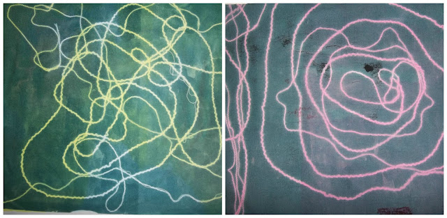
 To create these samples, I first had to paint several sheets of paper with the transfer dyes, each sheet with a single block colour on it, once they had dried, I print one of the bright colours on to the white poly sateen fabric, then I lay wool over the top in patterns that resemble the light trails. Then the black sheet is placed on top and printed, when the black sheet and wool are pulled away I am left with samples like the ones above. As much as I like my first samples, I felt they weren't complicated enough to be light trails, so I tried layering up the colours. The process is very similar to the previous one, but instead of applying the black sheet once you have placed your first lot of wool down you place down another colour sheet, and once it has been printed you make sure the wool doesn't come away as you take away the paper, you then add more wool and print the black sheet over the top.


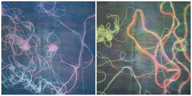
This slightly more complicated process can be very frustrating, as the wool likes to stick to the paper rather than the fabric; I don't think I have a sample using more than one colour layer where the wool has stayed where it's meant to. But I definitely like the more complicated samples. What I also found annoying is that the colours you use to create the patterns, effect how dark your "black" layer will be, because the black transfer dye isn't completely black, which would make it difficult to do a large piece of fabric.

Friday 12 April 2013

Light Trails no.2

Today we went to take more light trail photographs (now using the park instead of the beach, so that we didn't have to walk for an hour!). I tried to buy more glow sticks that would be colours that resembled the northern lights more than my first attempt, however the shop's stock of thick glow sticks was very low, so I could only get hold of blue and yellow ones. I was hoping that if I moved them fast enough it might create a green glow.


Because I liked the effect so much from my previous test shot, I wanted to use the light produced by the torch on my phone; I really love the crisp bright light trail it made. But because it doesn't really represent the northern lights on it's own, I decided to combine it with the movement of the glow sticks. The photo in the top left is my favourite, I used a purple filter of the top of the light and combined it with the blue glow stick, and I just love the effect; it's so pretty and slightly hypnotising! That one was produced by holding the two light sources in different hands and moving them at different spends, whereas the photo in the bottom right was done by holding both light sources in the same hand and creating trail.

Sunday 7 April 2013

Light Trails, which is better...?

I really liked the effect of the light trails, but I wanted to find somewhere where there wasn't any other artificial light, so we went to the park to do a test shot (the first image), however I didn't have any more glowsticks to do the test shot with, so I just used the torch on my phone! And when I looked back at the shot I was really pleased with the effect, however I wasn't sure if I liked it enough to start using my torch instead of the glow sticks, so I decided to take advantage of out facebook group for the final major project to get some opinions.


After reading the advice I decided it would be best to try and combine the effects and just take as many photos as possible. And now I have a new place to take the photographs that isn't so far from home. And the morephotos I have, means the more primary research I have, as this isn't the easiest project to gather primary research for.

Friday 29 March 2013

Easter Holiday Plans

Things I plan to do over the easter holidays:
  • Make sure my skecthbook is completely annotated
  • Take more light trail photographs
  • Begin drawing
  • Begin gathering photos for construction and colour ideas for final outcomes
  • Begin infleunces essay
  • Prepare presentation.
  • Begin mood boards
  • Research creating textile patterns with bleach (adding more research to pinterest if I can't print it off)

Tuesday 19 March 2013

Light Trails no.1

With the first lot of light trail photographs I was very limited with what I could do as I couldn't alter the exposure time, however with a more advanced camera (even though the longest exposure time is only 30 seconds) I was able to change the exposure time so it could capture the movement of the light.


I tried to find a location that had limited other lights, which I thought I had, however a few golden lights have turned up, however I don't feel they ruin the photographs, so it's okay. 
Because these turned out so well I want to experiment with some other colours, instead of just editing these on Photoshop, and hopefully I can experiment with two colours in one shot and see what effect that has.
So I shall be off to buy some more glow sticks!

Thursday 14 March 2013

Workshop no.3

To develop from our prints we started to use other methods.
The first was using layers of stuck down materials to create surfaces for prints, or prints by themselves, my first one was to look like the northern lights; the ripples of light coming down, I was hoping that when it was printed there will be a contrast in the strength of colour so that that I can work into it. The second was purely just to create interesting shapes and surfaces, so would hopefully inspire something else.


The second method we used is called carborundum printing, this is using sand to create a surface that once dried can be used for printing. It is quick and easy to do. However it does have it's limitations, because although you could create quite intricate drawings with the glue and sand, it is only one level and may lack the illusion of depth once printed, they can also only be used a couple of times.


The first carborundum print was inspired by this photograph taken from 'Landscape Photography'. I really love the effect of star trail photographs, because it shows and tiny and insignificant earth can be when you can see the movement of the stars around you, if it's possible I would quite like to have a go at producing these types of photos.
The second print was inspired by the movement of the northern lights and the third, slightly from the star trail photo, but pulling the trails in unconventional directions.

Tuesday 12 March 2013

Workshop no.2

Today we were progressing our pieces from the drawing workshop yesterday by trying to translate some of it in to mono-prints. One of the methods we were shown was rolling the ink out on the surface, placing a piece of paper over it and drawing directly on to the paper so that on the opposite side our drawing would appear in ink. Another method was drawing directly into the ink so that when we printed the image it would print the negative space. However I didn't feel that either of these methods really related to my project, so instead I decided to combine two different colour ink and force them together, using the roller to create wave like patterns. At first I was skeptical about how it would turn out, but I was unbelievably happy with the print.


I then tried a version of the drawing in method, but instead of drawing an image I tried to incorporate the wave movement from above. 


Which I think was very successful as well, I would love to come up with a way that I could translate this into fabric, without creating a silk screen, as I wouldn't want it to be an obvious pattern, as natural phenomenons are very unpredictable and never look the same, so having a pattern would defeat the object of what I am trying to achieve.