
Throughout
my final major project I have been researching many different types of natural phenomenon’s,
such as, the Antelope Canyon. These were formed when the flash flooding eroded
the Navajo Sandstone, as well as other processes, like rainwater. During
monsoon season it would run into the narrow passageways, which overtime eroded
them, making the canyons deeper, as well as smoothing the hard edges, which
formed the “flowing” edges. I also looked at striped icebergs. The stripes are
caused by microscopic cracking due to thermal stresses; letting air in to the
ice, turning it white (the “normal” colour of a glacier is blue, this is
because of the way that ice transmits light, by scattering atoms, molecules and
impurities), the stripes occur when the now white icebergs crack again, letting
the blue reappear on the surface.
 |
| Antelope Canyon Striped Iceberg |
Even after researching all different types of
phenomenon’s, I still find that I am mostly drawn to phenomenon’s that are
associated with light and occur in the sky, such as Auroras, Fire Rainbows, Sun
Halos and Supernovas. My favourite of all the phenomenons that I have
researched are the Aurora Borealis, otherwise known as the northern lights, these are caused by
electrically charged particles in space hitting the Earth’s atmosphere. When
the particles collide with nitrogen and oxygen particles they emit excess
energy as light. The colour of light produced depends on the particles that
collide and how high they collide above the Earth, for example, the common
yellow-green lights are caused by oxygen molecules colliding about 60 miles
above the Earth. There is something about it being in the atmosphere and so
untouchable that makes it so fascinating, we can see them, can even understand
the explanations of why they occur, but we can never be part of it, we can’t
visit it and touch it like we can the grand canyon or even a striped iceberg. This
is what mostly attracts me to them, and why I want to focus on these types of phenomenon’s,
I can’t be part of it so I want to materialise it in a collection of garments. I did this by experimenting with print.
 |
Wang Pieyi
Fall/Winter 2013/14 Collection
|
 |
| First Bleach Sample |
 |
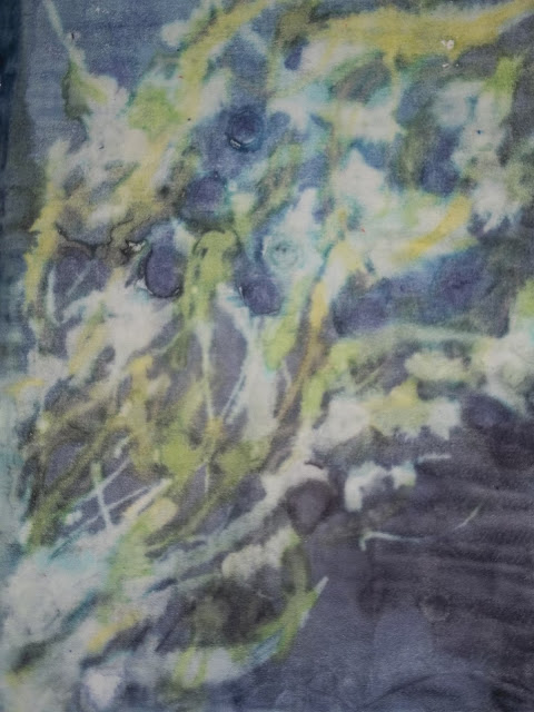
Richard Weston
Elestial Quartz silk scarf
|
After looking at many different artists, my biggest inspiration is definitely Wang Peiyi's collection combined with the wonderful tutorials I have found for bleaching garments. I will continue to use Peiyi's collection for inspiration in terms of design/structure, colours and our shared theme.
word count: 1251
Bibliography:
- Challoner
J, John Farndon, Kerrod R, Walshaw (2000), Planet Earth How the World
Works shown in 1000 Photographs.
- Graham I (1999). All About Space
Amazing Cosmic Facts.
- Cornall Tasha (2012) Do It Yourself: Bleach Dress. The Saint [online]. Available from: http://www.thesaint-online.com/2012/08/do-it-yourself-bleach-dress/ [8th April 2013]
- Ericson Lois (2008). Dyeing with Bleach. Threads [online] 28th October 2008. Available from: http://www.threadsmagazine.com/item/3720/dyeing-with-bleach/page/all [9th April 2013]
- Jing
Daily (2013) Chinese Designer Wang Peiyi Closes Out
- Linberg Christensen L, Fosbury R, Hurt R (2009). Hidden Universe. Weinheim: WILEY-VCH
- McQueenWorld (2010). Alexander McQueen | Women’s Spring/Summer 2010 | Runway Show. Youtube.
17:13http://www.youtube.com/watch?v=zkvVgvaKJgA&feature=player_embedded
[7th March 2013]
- Mitchell
P (2007). Landscape Photography of the Year Collection 01.
- Prochemical (2010). Potato Dextrin and Bleach Discharge. PRO Chemical and Dye [online]. Available from: http://prochemical.wordpress.com/2010/01/01/potato-dextrin-and-bleach-discharge/ [9th April 2013]
- Richard Weston Studios (2011) Richard Weston Studios: Fabrics [online]. Available from: http://www.richardwestonstudio.com/fabrics.html [21st April 2013].
- Sparrow G (2011). The Natural World Close-Up. Quercus.
- Weston Earth Images: Richard Weston Silk Scarves [online]. Available from: http://www.westonearthimages.com/weston_scarves.php [21st April 2013].
No comments:
Post a Comment